The Electoral Geography of
Exploratory Spatial Data Analyses (ESDA) of Protestant
Support for the Nazi Party[1]
John O�Loughlin
Department of Geography
Campus
Email: johno@colorado.edu
Acknowledgements
The research reported in this paper was supported by
grants from the Geography and Regional Science Program of the National Science
Foundation.� Earlier versions of the
paper were presented at �New Methodologies for the Social Sciences� conference
at the
Abstract
For over half a century,
social scientists have probed the aggregate correlates of the vote for the Nazi
party (NSDAP) in
1� Introduction
Despite attempts to bridge the epistemological and
methodological gaps between the disciplines of geography and political science
recently, lack of awareness of developments in geographic techniques by
political scientists is still evident.[2]� Some reasons can be proffered for this
neglect, not the least of which is the nature of the data deployed by political
methodologists in their analyses.� Over
time, data collected from surveys of individuals have become the norm and,
partly because of difficulties of inference across levels, political scientists
have tended to eschew aggregate data collected for geographic units (King,
1997).� The preponderance of
individual-level data is of relatively recent vintage.� A classic
study of political behavior, V.O. Key�s
(1949) Southern Politics in State and
Nation, used aggregate electoral data, while Pollock�s (1944) study of Nazi
party electoral success pointedly relied on a geographical analysis of the
aggregate votes.� King�s (1997)
ecological inference methodology was recently the subject of a forum in the
leading
The purpose of this paper,
using the example of voting for the Nazi party in
In examining the nature of
aggregate data distributions and possible causal relationships, it emphasizes
methods of exploratory spatial data analysis (ESDA � see Anselin, 1995), most
of which have been developed in the geographical sciences and are increasingly
available in specialized mapping and analyses software for the environmental
sciences.� Despite the addition of
geographic modules to statistical software (such as the S-Plus module for ArcView GIS�), most of the users of such software seem to
be environmental scientists (geologists, physical geographers, biologists,
ecologists, engineers) interested in statistical data properties rather than
social scientists with a bent towards the examination of aggregate data.� Though survey data suffice nicely for most
political topics, some research questions force the use of aggregate data.� These include analysis of historical
political questions that predate the arrival of reliable survey data (including
the forces behind the electoral success of the Nazi party in Weimar Germany),
political behavior in countries without national-level survey data but with
acceptable census data (much of the world falls into this category), and
questions that focus on the context of political decisions, forcing a
consideration from the individual to the neighborhood and larger scales. Events
data in international relations, gathered for countries and sub-state units,
can also be analyzed using the spatial methodology (Murray et al;, 2002)
����������� Spatial
autocorrelation is the most fundamental concept in geography and integrates the
growing set of spatial statistical approaches with the key elements of the
discipline.� A
geographic truism, often known as the First Law of Geography (Tobler 1970, 236), states that �everything is related to
everything else but near things are more related than distant things.�� Across all specialized branches of geography
and across all epistemological divides, spatial autocorrelation underpins
geographic assumptions, methods and results.�
The (relative) order generated by spatial autocorrelative
processes, the distribution of phenomena on the earth�s surface has been well
documented in thousands of studies and simple observation, we know that
clustering of like objects, people and places is the norm.
Geostatistical methods are typically
configured for large samples and are used widely by environmental
scientists.� In order to introduce these
methods to human geography, we need both larger datasets (many aggregate
geographic units, also called polygons) than those to which we are accustomed,
and a point sampling strategy.� At a fine
scale of resolution, every spatial distribution is discontinuous.� The main difference between geostatistics and spatial autocorrelation is that the
former deals with point sampling, usually on a grid, of a continuously geographic
phenomenon (like a forest), the latter deals with a division of a geographic
surface, thus producing an aggregation of geographic phenomena (Griffith and
Layne, 1999, 457).� With a large number
of polygons, say approaching 1000 units, a centroidal
or some other point sampling strategy offers a reasonable approximation of a
continuous surface that can be modeled using geostatistical
methods, like kriging (a statistical interpolation
method that predicts values for unsampled locations
on a surface) and trend surface analysis (fitting a linear or polynomial trend
to a latitude, longitude and height surface).
In this paper, geostatistical methods are heavily used.� Mantel correlation analysis (correlating distance and difference vectors)
and variography -the process of pattern
description and modeling using the variance of the difference between the
values at two locations- are used to help understand the distribution of the
Nazi party votes.� Vector mapping (identifying
local directional trends) and directional spatial correlograms (summary
measures of association by major angles and distances) are added to the usual
tools of spatial autocorrelation analysis- Morans I
and G*i, measures of global and
local spatial association- and GIS mapping in this paper.� Wombling analysis (identification of
statistically significant boundaries on a surface) is applied for the first
time to a political geographic problem.�
2
Because of the use of methods based on point sampling,
a dataset with many cases is preferred for analysis, and ideally it should also
retain substantive interest.� I chose the
example of voting in
����������� Much
is known about the NSDAP vote from a variety of authors (Childers, 1983;
Falter, 1986, 1991; Kater, 1983; K�chler,
1992).� Highly relevant to this paper,
researchers have generally concluded that the geographic pattern is highly
complex, with both strong local and regional elements, and that the correlation
between the vote and compositional factors (e.g. religion, class, occupation, gender) is relatively weak.��
Until 1928, the NSDAP aimed its platform at blue-collar workers, but it
had unexpected success in rural areas.�
Thereafter, the NSDAP targeted farmers, skilled workers, shopkeepers and
civil servants, following a lower-middle class strategy that was bolstered by
strong support for private property.�
Rural areas of
For purposes of our earlier
work, we divide Weimar Germany into six regions based on historical and
cultural attachments; these regions overlap to some extent with the post-World
War II� Federal L�nder that also were predicated
on the notion of regional attachments.�
The regional boundaries are shown in Figure 1.� In this present paper, these regions are not
used as predictors, but reference is made to them in describing the map patterns
and in probing the map�s spatial structure.�
The Nazi party took advantage of this regional mosaic by pushing a
variegated appeal that was modified from locale to locale depending on local
conditions (Heilbronner, 1998; Ault and Brustein, 1998; Brustein, 1990,
1996; Brustein and Falter, 1995; Kater,
1983; Stachura, 1980).� The
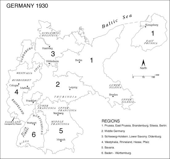
Figure 1:� The Six Historical-Cultural Regions of
Since the main purpose of
this paper is to describe and highlight the geographic elements in the support
for the NSDAP, I will analyze a series of votes between 1924 and 1933 but I
center the analysis on the 1930
����������� The
key dependent variable for analysis is the percentage of the 1930 valid vote
received by the NSDAP in each of the spatial units.� The distribution of the Nazi ratio of the
1930 vote is shown in Figure 2.� While
the map makes regional and local clusterings evident,
it is lacking in wide bands of similar values.��
In general, the distribution of strong Nazi party support corresponds to
the Protestant regions of the country, with largest values in
3
The NSDAP in
In this study I examine NSDAP
support in Germany using six analytical steps: a) global indicators of spatial
autocorrelation, b) distance and variance patterns, c) local indicators of
spatial association, d) directional spatial autocorrelation analysis, d) vector
mapping, and e) wombling (barrier identification).��� The percentage of the vote for the NSDAP is
used throughout this study since it allows comparison to previous works and, in
many ways it is the easiest indicator to both visualize and comprehend in the
spatial analysis.� The general indicator
of the NSDAP vote is a conglomerate of the support of various constituencies
for the Nazi party. One of several key correlates of Nazi party support have
been identified in previous studies, I also use the ecological estimates for
NSDAP voter turnout and Protestant population support for the NSDAP.� To estimate the ratio for the 743 geographic units,
I used the EzI version of the King program that does
not require the use of the Gauss program (EzI: A(n Easy) Program for
Ecological Inference by Kenneth Benoit and Gary King)
available from http://gking.harvard.edu/stats.shtml.�
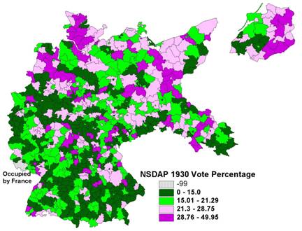
Figure 2:� Distribution
(Quartiles) of the NSDAP 1930 Vote in Percentages
The EI (Ecological Inference) method has
gained a great deal of press and familiarity in political science since it was
first introduced by Gary King (1997).�
King has promoted his ecological inference technique as a method that
allows disaggregation of the global (whole study
region) estimates to the individual units that comprise the aggregate.[4]� These estimates can be mapped, as King (1997,
25) illustrates for the white turnout in the 1990
Using the EI methodology, I
am interested in whether the group of interest, the Nazi party, showed a
significant gain over its opponents in turning out its voters.� Knowing the marginals
(votes for the NSDAP and non-NSDAP parties, the turnout and the eligible
voters), we can use EzI to estimate the NSDAP voter turnout using the
accounting identity (King�s notation):
Ti
= βibXi +
βiw (1-Xi), ������������������������������������������������������������� (1)
where Ti is the proportion of NSDAP
voters turning out to vote in each Kreisunit[5]; Xi is
the proportion of the voters that picked the NSDAP; 1-Xi is
the proportion of the vote for all other parties; βib
is the proportion of the NSDAP supporters that came to the polls; and βiw is the proportion of
non-NSDAP supporters who came to the polls.�
The purpose of the EzI modeling is to estimate βb
(the aggregate turnout rate for Nazi voters for the whole country); one
can also get estimates for the individual counties and cities (Kreisunits), bib . Both Ti� and Xi �are known values, and βib
and βiw are the
unobservable parameters of interest to be estimated using King�s ecological
inference method.� (Full
details are available in King, 1997). Two key indicators -the estimated
turnout of NSDAP voters and the estimated ratio of Protestants who voted for
the NSDAP- are spatially examined in this study.
Table 1: EzI Estimates for Turnout of NSDAP Supporters in Reichstag Elections, 1924-1933��
Election Date
|
No. of Cases
|
Ezi Estimate
|
Mean Turnout
|
+/- to NSDAP*
|
May 1924
|
930
|
.616
|
.743
|
-.127
|
December 1924
|
927
|
.899
|
.767
|
+.132
|
1928
|
940
|
.860
|
.759
|
+.101
|
1930
|
916
|
.809
|
.811
|
-.002
|
July 1932
|
924
|
.903
|
.818
|
+.085
|
November 1932
|
911
|
.882
|
.782
|
+.100
|
1933
|
883
|
.808
|
.870
|
-.062
|
* Gain and loss to
the NSDAP calculated from the estimated NSDAP turnout compared to the mean
turnout.� The number of spatial units
varies from election to election as a result of data availability in the Weimar
German file.
��
The key comparative data for
all Weimar Reichstag elections are shown in Table 1.� The NSDAP voter turnout slipped below the
national average in only the first and last elections (May 1924 and 1933).� During the year of the rapid party growth and
electoral surge, 1932, the turnout of NSDAP voters exceeded the national
average by 8.5% and 10%, significantly boosting the party fortunes.� The methods by which the NSDAP managed to
activate its supporters are detailed in Brustein
(1996), Grill (1983) and
����������� From
previous research, it is clear that the key compositional predictor of the
NSDAP vote in
EzI estimates indicate a
3.6% gain to the NSDAP from protestant voters in 1930, the breakthrough
election for the party.� By the July 1932
election, the advantage had risen to 9.0%.�
The advantage is calculated as the difference between the overall NSDAP
vote ratio of 18.3% and the EzI estimate of
Protestants voting for the NSDAP of 21.9%.�
In 1932, the respective figures were 37.4% and 46.4%.� Data presented in table 2, however, suggest
that German voting patterns were in fact quite complicated and that strong
regional attachments remained.� The
comparisons to the national and regional means for the NSDAP clearly indicate
the variegated nature of the core relationship.�
Table 2:� Regional Pattern of EzI Estimates for
Protestant Ratio and NSDAP Vote 1930*
Region
|
Number
of Cases
|
EzI Estimate |
Protestant Ratio |
NSDAP 1930 Ratio |
Regional Gain/Loss |
National Gain/Loss |
|
|
193 |
.216 |
.786 |
.214 |
+.002 |
+.033 |
|
|
144 |
.203 |
.829 |
.199 |
+.004 |
+.020 |
|
|
74 |
.271 |
.837 |
.243 |
+.028 |
+.088 |
|
|
124 |
.211 |
.458 |
.155 |
+.056 |
+.028 |
|
|
150 |
.289 |
.270 |
.167 |
+.122 |
+.106 |
|
Baden-W�rttemburg |
58 |
.174 |
.549 |
.152 |
+.022 |
�-.009 |
*The
mean national percentage for the NSDAP was 18.3% for a total number of cases of
743.
While caution is warranted for the
estimates from
The estimates for the 743 Kreisunits
are derived from simulations, using a number of random samples from the
distribution of values within the bounds of each Kreisunit
that are set by the marginal totals of the cross-tabulations for each (King,
1997).� The geographic distribution of
these estimates for 1930
The comparative figure for the turnout of the Nazi party supporters
is the estimated national mean of .811.�
Lowest values (below .75) are found in some of the regions of highest
party support (eastern East Prussia, Oldenburg and Schleswig-Holstein) as well
as in mostly Catholic or mixed religious regions in the West and South.� Similarly, highest turnouts of Nazi party
voters are in
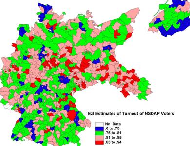
Figure 3:� EzI Estimates of the Turnout of NSDAP Voters,
1930
4� Global Indicators of Spatial Association
In
spatial analysis, global summary measures of distributions are now as common as
statistical distribution measures that are typically presented in the social
sciences (Rogerson, 2000).� The limitations of the usual mean and
variance statistics are evident when a simple choropleth
map of the distribution of the NSDAP vote shows regional clustering.� Towards the goal of summarizing a geographic
distribution, the Morans I measure is now most
commonly presented, though there are alternative measures of spatial patterns
(see Cliff and Ord, 1981; Bailey and Gatrell, 1995).�
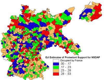
Figure 4:� EzI
Estimates of Protestant Support for the NSDAP, 1930
Morans I is
derived from:
I = (N/So)Si Sj wij
xi xj / Si xi2, �����������������(2)
where wij� is an
element of a spatial weights matrix W that indicates whether or not i and j are contiguous; the spatial
weights matrix is row-standardized such that its elements sum to 1; xi
is an observation at location i
(expressed as the deviations from the observation mean); and So
is a normalizing factor equal to the sum of all weights (Si Sj wij). The significance of the Morans I is
assessed by a standardized z-score that follows a normal distribution and is
computed by subtracting the theoretical mean from I and dividing the remainder
by the standard deviation.�� Spacestat � version 1.90 was used for the
calculation of the spatial statistics used (Anselin, 1998; Anselin and Bao, 1997).
����������� While
the Nazi map patterns are complex and apparently disorganized, calculation of
the Morans I measure of spatial correlation suggests
otherwise.�� The values for five spatial
lags are presented in Table 2.� Since
contiguity is defined here as a shared Kreisunit
boundary, a fifth order neighbor would be reached in five spatial steps across
the separating geographic units.�� While
the issue of the choice of contiguity metric is debated not only in geography
(Harvey Starr and his colleagues have written widely on the subject of
measuring contiguity in international relations � Siverson
and Starr, 1991; Starr, 2002), it is generally agreed that the nature of the
data should dictate the choice of metric.�
Thus, distance metrics are typically presented for indices of spatial
autocorrelation for trade while border contiguity is more plausible for international
conflict analyses (O�Loughlin, 1986; Griffith and Layne, 1999).�� In earlier work on
Table 3: Morans
I for Spatial Autocorrelation in District EzI Estimates of NSDAP Vote, 1930
|
Variables |
Lag 1 |
Lag 2 |
Lag 3 |
Lag 4 |
Lag 5 |
|
NSDAP30 |
.260 |
.164 |
.112 |
.071 |
.062 |
|
|
|
|
|
|
|
|
Turnout |
.203 |
.151 |
.131 |
.105 |
.092 |
|
(Turnout_ezi) |
.156 |
.108 |
.079 |
.058 |
.038 |
|
|
|
|
|
|
|
|
Protestant |
.566 |
.491 |
.409 |
.323 |
.239 |
|
(Protestant_ezi) |
.120 |
.015* |
.016* |
.017 |
.011 |
* not significant at α = .05
The correlograms for five spatial lags (first-order neighbor,
second-order neighbor, etc) of the five variables of interest follow the
classic pattern in spatial analysis - decreasing positive values with
increasing lags, with the greatest decline from the first to the second
lag.� Because the number of cases varies
from lag to lag (some Kreisunits did not have
higher order neighbors), comparison of the Morans I
values requires caution.� The population
distribution variable (Protestant ratio) is clearly -and unsurprisingly- more
geographically clustered than any of the other variables.� Because of centuries of religious conflict
and accommodation, political compromise and geographic allocation, the
religious map of
Table 4: Morans I Test for
Spatial Correlation - Variables and District EzI Estimates, 1930
|
VARIABLE (EzI estimate) |
|
Central |
Northwest |
|
|
W�rttemburg |
|
|
|
|
|
|
|
|
|
Number of Cases |
193 |
144 |
74 |
124 |
150 |
58 |
|
|
|
|
|
|
|
|
|
NSDAP 1930 |
.349 |
-.060* |
.106* |
.204 |
.181 |
.286 |
|
|
|
|
|
|
|
|
|
Turnout |
.335 |
.256 |
.159 |
.185 |
.116 |
�
.035* |
|
(Turnout_ezi) |
.285 |
.150 |
.166 |
-.113* |
�
.046* |
.169 |
|
|
|
|
|
|
|
|
|
Protestant |
.541 |
.040 |
.348 |
.384 |
.521 |
.035 |
|
(Protestant_ezi) |
.134 |
-.050* |
-.078* |
.211 |
.150 |
.154 |
* not significant at α= .05
The Morans I values for the first order
lags of the six cultural-historical regions are presented in Table 4; again,
caution in comparison is warranted because of the variable number of
cases.� The main contrast in this table
is between the regions with significant positive spatial autocorrelation (
����������� A consistent feature of Morans I values for political geographic data is one of
positive and significant spatial autocorrelation.� Clustering of geographically distributed
phenomena is the norm and has been documented for many political variables
across an array of contexts.� Voting
surfaces are especially marked by positive spatial autocorrelation especially
for small-scale units like wards or precincts.�
As the size of the unit increases, it typically becomes more heterogenous and the Morans I
values tend towards indications of less clustering.� The Weimar case study is interesting not only
for its historical significance but also because the base map (distribution of
the NSDAP vote in 1930) shows regional heterogeneity, local dependence (spatial
autocorrelation), national trends (northeast to southwest), and a complex
association between the predictor and dependent variables.� Partly because of these complications, most
studies of the Nazi party have been case studies of one or a few localities (a
small city or a rural area) using archival materials.� While these studies offer a great deal of
information about the mechanisms of the party�s strategy and successes, they do
not provide much help in understanding the national picture.� Is it an amalgam of local stories with no
common denominator or a macro-level process with local deviations?�� The methods of spatial analysis can help to
determine the answer.
A final analysis of non-directional global statistics concerns the
changing Morans I values over time.� It is worth remembering that the NSDAP
support ranged from 6.5% in their first national effort in 1924 to 43.8% at the
last Reichstag election of 1933.� Several
trends are immediately apparent from the lagged Morans
I values of Table 5.� As expected, the
values drop consistently with increasing lags and the values at the third lag for
the early elections (before 1930) are negative and significant, indicating a
chessboard-like pattern of high and low values.�
The most extreme Morans I value is that for
the first election, May 1924, when the NSDAP was a small minority and had only
scattered support throughout
Table 5: Distribution of Morans I Values for the NSDAP Vote in all Elections
|
Elections
and Changes
between Elections |
Lag 1 |
Lag 2 |
Lag 3 |
Mantel Test |
|
|
coefficient |
Z-score |
||||
|
May 1924 |
.313 |
.058 |
-.065 |
-.032 |
-1.59 |
|
December
1924 |
.175 |
.028 |
-.043 |
.010 |
0.46 |
|
1928 |
.210 |
.013 |
-.025 |
-.014 |
-0.07 |
|
1930 |
.161 |
.025 |
.012 |
.082 |
4.94* |
|
July 1932 |
.202 |
.057 |
.037 |
.070 |
4.89* |
|
November 1932 |
.176 |
.023 |
.010 |
.042 |
2.82* |
|
1933 |
.113 |
.027 |
.019 |
.072 |
4.68* |
|
Change 5/24
� 12/24 |
.272 |
.056 |
-.029 |
-.022 |
-1.06 |
|
Change 12/24
� 1928 |
.128 |
.046 |
.025 |
.052 |
2.45* |
|
Change� 1928 � 1930 |
.219 |
.128 |
.096 |
.202 |
13.17* |
|
Change 1930
� 7/32 |
.157 |
.027 |
.017 |
.013 |
0.85 |
|
Change 7/32
� 11/32 |
.139 |
.084 |
.072 |
.042 |
2.09* |
|
Change 11/32
� 1933 |
.301 |
.100 |
.054 |
.058 |
2.92* |
* Z-score significant at .05 level.
�����������
5�
Global Analysis of the Voting Surfaces � Mantel Analysis and Variograms
Geography has
been often and crudely described as a �discipline in distance.�� Two specific tests for this general
proposition are used here.� Global
spatial association is measured by a widely used test (Mantel, 1967) that
examines the relationship between two square matrices, typically distance
matrix (in this study, the distances between the centroids
of the Kreise) and some other
measure of (dis)similarity between the points (here,
the difference in their NSDAP % values).��
The analytical question is whether the value of the index indicates that
the distance similarity is significantly related to the compositional
similarity.� A permutation procedure is
used to estimate if the test statistic is significant by resorting the rows and
columns of one of the matrices at random and comparing the resulting values. �A variogram is a
display of the spatial properties of the data, and a general upward curve with
increasing distance to a threshold (or sill) is expected for spatial data, with
increasing distance (Bailey and Gatrell, 1995).
����������� �The basic Mantel statistic is the sum of the
products of the corresponding elements of the matrices
Ζ = Σij �Xij Yij,������������������������������������������������� (3)
where Σij
�is the double sum over all i and all j, j ≠ i. ��Xij is the matrix of inter-centroidal
distances and Yij is the difference in the NSDAP percentages between the respective
geographic units.� Like any
product-moment coefficient, it ranges from -1 to +1 and its significance can be
tested through a t-test after randomly permuting the order of the elements of
one of the matrices (Dutilleul et al., 2000).� Illustrating the Mantel test using the same
sequence of elections and between change elections as the Morans
lagged values, shown in Table 5, one can see the same
general results between the two tests.��
This is expected since both are product-moment coefficients, but in this
instance, they use different measures of distance (border contiguity for the Morans I values; inter-centroidal
distance for the Mantel tests).� Election
patterns after 1930 and inter-electoral change after 1924 especially 1928-1930,
is strongly related to distance between the spatial units, further
evidence of the contagious spatial diffusion inherent in the growth of the Nazi
party.�� �
���������
Variogram analysis is often referred to as geostatistical
analysis because of the central role that this methodology plays in physical
and environmental geography.�� The focus
is on the graph of the empirical semivariogram
computed from half of the average of (i- j)2 for all pairs of locations separated by distance h.��
Rather than plotting all pairs, making it impossible to distinguish the
graphs in a large data set- the data are grouped by distance bands and the
empirical semi-variogram is the graph of the averaged
values.� Every spatial statistical
package includes a module for the calculation and display of variograms (Kaluzny et al,
1998; Bailey and Gatrell, 1995; Johnston et al,
2001; Griffith and Layne, 1999) and variography has
been widely disseminated through the work of Cressie
(1991) and Diggle (2002).� Variogram
computation and display is the first step in developing predictive models of
spatial surfaces and for interpolating data locations, such as with kriging.� The
analysis here was completed using Surfer�7 (Golden Software, 1999).� Variograms are often computed for different directions if there
is a suspicion of anisotropy (directional biases and trends in the data); the
models plotted here are omnidirectionally calculated
and are the simplest models with no assumptions of directionality.
The plot for the NSDAP vote in 1930 (Figure
5a) shows a classic variograph pattern, indicating
the presence of a large-scale trend or non-stationary stochastic process in the
data.� In contrast, the plots of the EzI
estimates for the turnout of the NSDAP voters (Figure 5b) and the Protestant
support for the NSDAP (Figure 5c) show no distinct trend with distance, and
these surfaces can be considered as stationary.�
In a stationary process, the variogram is
expected to rise to an upper-bound, called the sill and the distance at which
the sill is reached is the range.� Centroids that are separated by less than the value of the
range are spatially autocorrelated, while those with
inter-centroidal distances beyond the value of the
range are uncorrelated.��
A comparison of the ranges of the three graphs shows that the range
(lag distance) is reached at a value between 2 and 4 for the EzI estimate
graphs; thereafter, the variogram is flat,
oscillatory or decreasing.� By contrast,
the graph of the NSDAP vote percentages (Figure 5a) continues to increase at a
range of 13-14, a clear indication of a large-scale spatial
autocorrelation.� King (1997) has
considered how spatial autocorrelation affects the ecological inference
estimates; it is clear from these variographs and
from the spatial measures (Morans I and local indicators
explained below) that the EzI estimates of NSDAP turnout and of the Protestant
support for the Nazi party are much less spatially autocorrelated
than the dependent variable and the individual predictors.� This conclusion does not preclude the possibility
of local anomalies or some regional trends; it simply accounts for the fact
that a control in the form of the EzI predictor removes much of the geographic
patterning.� King (1996), in a debate
with political geographers, argued that similar socio-economic factors account
for what underlies the geographic pattern of political phenomena and that
identifying and removing these trends should be the aim of the geographic
discipline.���
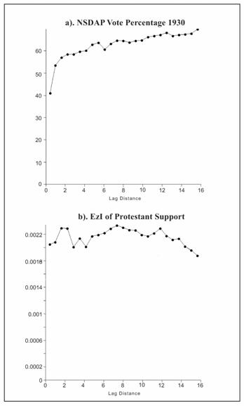
Figure 5: Variographs of NSDAP and
Protestant Distributions
�
6 Local measures of spatial association
A recent trend
in spatial analysis has been to disaggregate global statistics in order to
uncover local clusters or �hot spots.��
If there is significant, positive spatial autocorrelation evident in the
Moran I values (significant, negative autocorrelation would indicate a
checkerboard pattern of alternating high and low values), local measures are
used to identify the exact location of clusters of unexpectedly high or low
values that contribute to the size and direction of the global statistic (Ord and Getis, 1995; Anselin, 1995; Fotheringham,
1997; Rogerson, 2000).� Two other developments are pushing more use
of LISAs (local indicators of spatial association).� As more data for smaller geographic units
have become available and manageable in GIS databases, it is common to generate
highly significant global measures of spatial autocorrelation, like Morans I or Mantel coefficients, in situations with
hundreds of data units.� But whether
these statistics are substantively interesting is hard to say without recourse
to other, more disaggregated analyses.�
Secondly, the modified areal unit problem
(MAUP) - a function of the essentially arbitrary nature of geographic
boundaries in dividing up a surface into sub-units - means that global
statistics remain somewhat arbitrary.�
Consider that a different spatial arrangement and the re-aggregation of
the geographic sub-units would produce a different Morans
I, since the contiguity matrix and the number of cases would be altered.� A focus on local statistics helps to
highlight and clarify these dilemmas of geographic data.
A common tactic to identify these local outliers prior to the
development of the LISAs was to map and inspect large residuals from
regression, frequently by adding spatial autoregressive terms to the equations
(Anselin, 1988; Cliff and Ord, 1981).� The most commonly-used LISA is the G*i� (Ord
and Getis, 1995), which is defined by:
![]() �= Si wij(d) yj / Sj yj,,���������������������������������������������������������������������������� (4)
�= Si wij(d) yj / Sj yj,,���������������������������������������������������������������������������� (4)
where �wij(d) is an element in a binary contiguity
matrix (not row-standardized) and yj
�is an observation
at location j.� The ![]() �statistics should
be interpreted as a measure of like values around a particular
observation.� The significance of the
index can be assessed by standard Z-scores.�
A positive z-value for the
�statistics should
be interpreted as a measure of like values around a particular
observation.� The significance of the
index can be assessed by standard Z-scores.�
A positive z-value for the ![]() statistic at a particular location implies spatial
clustering of high values around that location; a negative value indicates a
spatial grouping of low values.�� The
values can then be mapped as I have done in Figures 6-8, with extreme values
that can be seen as the �hot spots�.
statistic at a particular location implies spatial
clustering of high values around that location; a negative value indicates a
spatial grouping of low values.�� The
values can then be mapped as I have done in Figures 6-8, with extreme values
that can be seen as the �hot spots�.
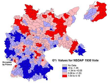
Fig. 6: Distribution of Local
Indicators of Spatial Association for the NSDAP 1930 Vote
The attraction
of the LISA method as tools to identify the clusters of low-low and high-high
values in a geographic distribution is immediately obvious from the map in
Figure 6.� The northeast-southwest
division of the country in the support for the Nazi party is readily visible.�� Within the two broad regions of support,
regional anomalies are evident in the west-central part of
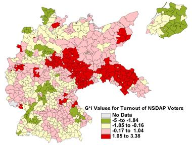 �
�
Fig. 7: Distribution of Local
Indicators of Spatial Association for EzI Estimates of Turnout of NSDAP Voters,
1930
����������� In contrast to the G*i map of the NSDAP votes
distribution, the two maps of the EzI
estimates of the NDSP turnout and the
NSDAP protestant voters show less clustering (Figures 7 and 8).� More values are non-significantly associated
with neighboring Kreisunits in high-high or
low-low zones, and the patches of neighboring high-high and low-low values are
typically small, scattered around the country and not clearly associated with
any underlying cultural-historical feature.�
Instead they appear to be associated with local phenomena.� Of the 60 G*i
values greater than +1.5, 27 are in
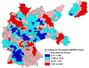
Fig. 8: Distribution of Local
Measures of Spatial Association for EzI Estimates of Protestant NSDAP Voters
1930�
The map of the EzI estimates of the Protestant support for the NSDAP
is more clustered.�� Numerous groups of
high and low Z-scores are evident in Figure 8.��
Of the 70 G*i values less than �1.5
for the EzI estimates of Protestant support for the NSDAP, 33 are found in the
Rhineland (western border of the country) and another 14 are in Baden-W�rttemburg (using the regional boundaries in Figure
1).� Of the 50 regions with G*i values greater than +1.5, 21 are in
����������� Use of the most common measures of
spatial analysis indicate a pattern of NSDAP support that is both highly
localized and weakly regionalized, except for a general NE-SW trend.� Unlike many contemporary electoral geography
maps, the NSDAP distribution (and its correlates) is more localized and not as
regionalized.� There are two possible
explanations for this difference.� First,
the elections in
7� Directional spatial autocorrelation
To this point,
I have used global and local measures of spatial association.� These measures do not consider the
possibility of any directional trend in the pattern.� To analyze geographic trends, trend-surface
analysis is often employed, where the independent predictors are the locational coordinates (east-west and north-south).
Furthermore, by making the surface more complex by adding terms (e.g.
quadratic, cubic, etc), surface models can often be developed that fit the
pattern well.� If the surface is more
complex with many ridges, valleys and depressions, one quickly reaches the
point of diminishing returns in adding terms.�
Recent developments in spatial analysis have blended locational
and structural indicators (the socio-economic attributes of the geographic
units) as independent predictors in regression models. [6] �
����������� Prominent among these new spatial
methods has been a search for measures of spatial association that also take
direction into account.� In many
environmental geographies, such as climatology (e.g. wind direction) or biogeography
(e.g. diffusion of a tree infestation or the spread of a noxious plant),
directionality is a crucial factor in anticipating future developments and in
generating strategies to ameliorate the impending trends.� In these circumstances, the global spatial
association measures are disaggregated by direction so that it is possible to
determine predominant modes and routes of change.� In this way, spatial association is not only
a factor of contiguity but also of the angle of direction between the spatial
units.� The locational
coordinates of the geographic centroids of the
spatial units are the key controls, and contiguity is measured by circular
bands of increasing distance (called annuli) around the centroids.
����������� To this point, we have assumed
isotropy in the global models of spatial autocorrelation, that� interaction is equally possible and
predictable in all directions with no evidence of directional bias.� In the case of the NSDAP votes, this
assumption is questionable since the maps show some north-east to south-west
trends.� One method to determine whether
this trend is significant -whether these angular directions are more prominent
than others- is to model autocorrelation using a bearing autocorrelogram.
This method is one of a family of disaggregated autocorrelation measures that
help to determine anisotropic spatial patterns (variable directional bias in
the spatial pattern) (
�
Gij = Dij cos2 (θ - αij), ������������������������������������������������������������� (5)
where Gij
�is the ijth
of matrix G, ����������� Dij is the ijth
element of matrix D, and αij
�is the angular bearing of
points i and j.� If the two bearings point in the same
direction (θ - αij =
0), the function of cos2�� will
equal one; if the bearings are at right angles to one another, the function of
cos2 will equal zero (Rosenberg, 2002).� Typically, the reference angle θ
is due East and the correlation between V and Gθ is
calculated via a Morans I test and repeated for a set
of θ.� Rather than
calculating the bearing correlogram for all angles
between 0 and 1800,� the values are �calculated for a set of standard values (10,
20, 30 etc degree angles from θ).�
Other directional methods use wind-rose correlograms (Oden and Sokal, 1986; Rosenberg et al., 1999) where
the classes are based on both distance and direction.
In the bearing spatial correlogram, the weight variable incorporates not only the
distance or contiguity between points (centroids or
capital coordinates of a country) but also the degree of alignment between the
bearing of the two points and a fixed bearing; in this paper, the fixed bearing
is the east direction.� All analyses were
completed using PASSAGE (Pattern Analysis, Spatial Statistics, and
Geographic Exegesis), a program by Michael Rosenberg.[7]� Use of these methodologies has proven useful
in tracking genetic drift in
A bearing correlogram can be calculated in
the same way as the usual correlogram for spatial
autocorrelation, except that the distance is weighted by direction.� Distance bands are used to assign weights �
each distance class has an associated weights matrix W that indicates whether the distance between a pair of centroids falls into that class.� The weight matrix is
converted into a new matrix W� by
multiplying each entry by the squared cosine of the difference between the
fixed bearing and that of a pair of points, as in equation (5) above.� Pairs of points that do not fall into the
distance class have an initial weight of zero and are unaffected by the
transformation.� Pairs that fall into the
distance class are down-weighted according to their lack of association with
the fixed bearing, θ.� In the
bearing correlogram, rather than simply presenting
the coefficients in a table (as in Table 5), the bearing coefficients are
plotted against the angle.� Each distance
class (annulus) is represented by a concentric circle -or semi-circle since the
other half is redundant in a symmetric plot- and each coefficient is plotted
above or below the annulus ring.� The
distance from the ring represents the size of the coefficient, while a shading
or symbolic scheme can indicate its level of statistical significance (see
Rosenberg, 2000 and Rosenberg, 2002 for more detailed descriptions).
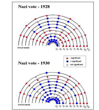
����������� Six bearing correlograms are
presented in Figures 9-11.� On each of
the semi-circular diagrams, the coefficient is plotted every 18 degrees (10 per
180 degree arc), while the annuli lines plot out the values for each distance
band.� Since autocorrelation is typically
larger at smaller spatial distances, a greater density of annuli is shown for
small distances in the plots.� The plots
demonstrate the geographic diffusion of the NSDAP in the early elections,
1928-1930, the period of electoral breakthrough.� In the 1928 election in which the Nazi party
received 2.6% of the vote, there is no clear distance (spatially lagged) or
directional trends in the pattern of support.�
The pattern is significantly and positively autocorrelated in all
directions at the first ring (inter-centroidal distances of 23 km) but only in
a northerly direction at the second lag (35 km).� By the third annulus (45 km), fewer
significant values are noted � again in a northerly direction.� In contrast, values to the east and to the
east-northeast as well as to the northwest are almost negatively autocorrelated
at all distance bands.��� At higher
distances, the pattern of coefficients is haphazard with non-significant values
prominent throughout the display.� The
display is typical of a spatially unordered process with some local
clustering.� However, in this case, the
clustering is not equally prominent in all directions.� The clines are evident to the east and to the
west -change from positive to negative autocorrelations is more evident in
these directions.� Clines can be
visualized as slopes in a topographic contour map and their presence indicates
a steep slope or change of values.
����������� By 1930, the pattern starts to
become more regularized.� In this year,
when the NSDAP vote reached 18.3%, the clustering is evident in all directions
to the second annulus (34 km) and significant coefficients are found to the
northwest in the 3rd ring.��
The negative coefficients are still prominent to the east and northeast
at the 4th and higher annuli, but the significant positive
coefficients to the north are visible to the 7th annulus.�� Again, the prominent clines are to the east
and northeast, indicating the most prominent directional trend on the map.� Thus, it is clear that the significant trend
in the Nazi party vote by 1930 had become a NE-SW one (the SW direction is not
plotted due to symmetry).
A diffusion study is a study of change between time periods or, in
this case, one of the changes in the NSDAP vote
percentages over time.� Figure 10
presents two bearing correlograms for the vote changes, December 1924-1928 and
1928-30.� As might be expected, these
correlograms show less randomness in the angular/distance distribution of the
Morans I coefficients.� In the period
1924-1928, when the NSDAP vote decreased by 0.4% (from 3.0% to 2.6%), there is
strong evidence of localized spreading for the first two annuli (to 35 km) and
to the north-northwest for the 3rd ring (45 km).� As is typical of spatial patterns, high and
significant negative coefficients are seen in all directions for the longer
inter-centroidal distances.��
 �
�
Figure 9: Bearing Correlogram of
NSDAP Vote Percentages, 1928 and 1930
The clustering of growth in the NSDAP vote continued between 1928 and
1930 (rise in the vote from 2.6% to 18.3%).�
The first four annuli (up to 54 km) show significant positive spatial
autocorrelation in all directions and to the northwest for the 5th,
6th and 7th bands (up to 84 km).� The cline is most evident in this direction
(NW-SE) and the diffusion of the NSDAP support demonstrates a trend along this
axis.� Party gains in the northern and
northwestern regions (
����������� �.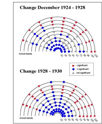
Figure 10: Bearing Correlograms
of Change in the Distribution of the NSDAP Votes
����������� Two further bearing correlograms for
the EzI estimates of the NSDAP voter turnout for 1928 and 1930, are presented
for comparison.� From these diagrams
(Figure 11), we can conclude that the patterns are also highly localized with
significant positive values seen in all directions for the first two annuli in
both elections.�� The trend continues to
the northeast in 1928 for two further annuli (up to 54 km) but disappears by
1930.� This NE-SW trend replicates the
pattern for the 1928 vote distribution but no cline is evident in the 1930 map
of the EzI estimates; instead, small local disconnected clusters scattered
around
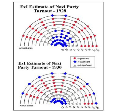
Figure 11: Bearing Correlograms
of the EzI Estimates of the Turnout of NSDAP Voters, 1928 and 1930
Bearing correlograms are useful devices for disaggregating global
autocorrelation measures like Morans I.�
In many spatial applications, association will vary not only by
distance, but also by direction.� Bearing
correlograms can help to determine if trend surfaces are significant, but they
also suffer from the fact that, as a general measure, the local components that
constitute or bias the trends cannot be determined from the general
measure.� Just as the Morans I (global)
statistic can be deconstructed and local indicators of spatial association
(LISAs) can be mapped, we now turn to vector fields as a way of examining the
local trends that cumulatively constitute the national directional autocorrelations.
8
Vector Mapping:[8]
In spatial
interaction analysis, use of vector mapping is helpful to visualize the
directions of flows.� Akin to maps
showing dominant wind direction and using the same symbolization (arrows of
various widths and lengths pointing in the direction of dominant flow), vector
maps have been widely used for portraying trade and migration flows, as well as
other interact ional data such as telephone calls, mail flows and international
cooperation-conflict -see the examples in Bailey and Gatrell, 1995, Chapter
9.� Tobler (1976) pioneered this
methodology in human geography and developed the concept of �vector
fields.�� Vectors,
shown by arrows of variable width and length, link origins and destinations by
indicating the direction of net flows.�
Repeating this for all flows shows the �wind of influence� at each origin� � a vector
showing the sum of all flows and directions.�
If there are enough data points, an interpolation can be made to a
regular spatial grid of locations.
In the example of NSDAP voting in this paper, we are not using
interaction data, though the analogy to interactional
data is useful.� Instead, a vector map
will contain two components, direction and magnitude, calculated from computing
the gradient of the surface grid.�
Perhaps the best analogy is a contour map where arrows point in the
direction of steepest descent (downhill) and the direction of the arrows change
from grid to grid depending on the topography surrounding the grid node.� The magnitude of the arrow changes depending
on the steepness of the slope, where longer vectors indicate steeper slopes
(Golden Software, 1999, 243).�� In a
highly patterned map with a large-scale and even change of gradients from a few
prominent nodes, the direction and magnitudes of the vectors will be consistent
and dramatic[9].� By contrast, a vector map of
slope gradients in a complex contour surface, such as cancer distribution in a
metropolitan area, will show a random pattern of small arrows pointing in
multiple directions, reflecting the lack of a dominant angular bias.� The surface vector mapping of the NSDAP vote
and the EzI estimates for the NSDAP voter turnout and the Protestant supporters
of the NSDAP were completed using Surfer7�.
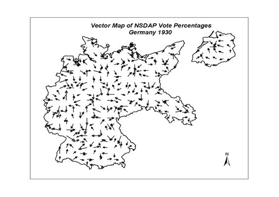
Figure 12: Vector Map of the NSDAP Vote Percentage, 1930
The directional correlograms had shown some general large-scale
(across multiple spatial lags) autocorrelation in certain directions, depending
on the variable under analysis.� What is
clear from Figures 12-14 is that the pattern is highly complex with multiple
�sinks� and �ridges� in the surfaces.� In
Figure 12 (vector fields for the surface of the percentage of the vote for the
NSDAP in 1930), �sinks� (places to which the arrows are directed) correspond to
major cities (
Similar localized vector maps can be seen in the EzI estimates for
the turnout of the NSDAP voters and for the support of the Protestant voters
for the NSDAP (Figures 13 and 14).� In
each case, there are more evident �ridges� than �sinks�.� On the EzI turnout vector map, sinks are
identifiable in the eastern edge of
The variation of support of the Protestant population for the NSDAP
is highly localized as indicated in the vector map of Figure 14.� While it is well known that the aggregate
correlation of the NSDAP vote and the Protestant population distribution is
significant, the EzI estimates do not show dramatic variations in the ratio of
Protestants who voted for the NSDAP (Figures 4 and 14).� The maps are highly localized and only small
pockets of higher and lower support than the national average are visible.� Lower values (sinks in the vector map) are
seen in
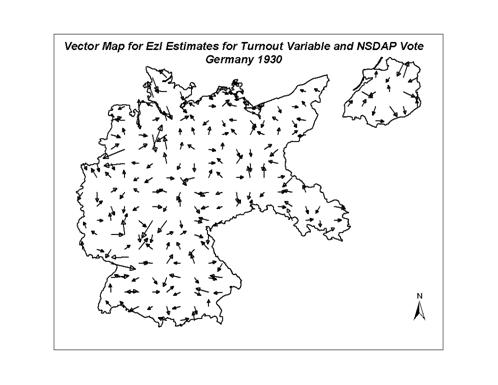
Figure 13: Vector Map of the EzI Estimates of the Turnout of NSDAP
Voters, 1930.
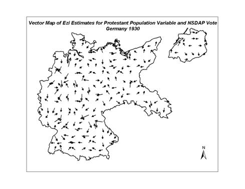
Figure 14: Vector Map of EzI Estimates of Protestant
Support of the NSDAP.
9� Wombling (Barrier Analysis)
A final
spatial analytical method that focuses on the regional differences across
shared boundaries to identify significant �barriers� (major differences across
the line) can help to determine the geographic extent and influence of these
barriers.� If the voting surface barriers
correspond to other regional lines (e.g., cultural regions), then we can
attribute significance to these historical bounds.[10]� Methods of detecting
difference boundaries are called wombling techniques, since they were first
quantified by Womble (1951).� Wombling
methods vary.� The magnitudes of the
derivatives of the surfaces can be added together to get a composite picture of
the barriers (if one has more than one measure, such as alleles) (Sokal and
Thompson, 1998).� In this study, a
simpler measure of difference uses a distance metric to measure the difference
between the values at the polygon centroids; only
adjacent polygons (sharing a boundary) are used in the dissimilarity
calculations.� Because the locations of
the polygon (Kreise) boundaries are known,
so-called �crisp boundaries� can be delineated.[11]
�Barriers mark the edge of a
homogenous area, demarcating it from different regions.�
In order to link sub-boundaries using BoundarySeer
(available from www.terraseer.com), certain criteria must be met if a polygon boundary element
qualifies as part of a defined barrier.�
Boundary Likelihood Values (BLVs) are spatial
rate of change indicators derived from gradient magnitudes; in this case, the
gradient is the difference in the value of the variable under consideration
(e.g., NSDAP percentage in 1930) between the centroids
representing the polygons.� By
introducing a percentage threshold (e.g., top 5% of values represent a
significant barrier and top 20% represent a modest barrier), a consideration of
significance can be introduced (Barbujani and Sokal,
1990, 1991).� There is debate in the
literature on the benefits of a priori determination of the cut-off
values, with some preferring to use the historgram of
values to find the thresholds.� Since I
am interested in comparing the barriers across the different wombling maps, I
opted for consistent percentage cutoffs.�
A second criterion in marking a barrier is a consideration of the
angular alignment of the sub-boundary units.�
Gradient angles are the direction of the maximum change in the BLV at a
specific centroid.�
The angle is calculated relative to a horizontal vector pointing east
from the candidate centroid.� The calculation is repeated for the second
candidate centroid.�
If the angular threshold for the maximum angle between gradient vectors
is more than 90 degrees, the boundary joining the centroids
is no longer considered as part of a defined barrier.� A second angular calculation is similar to
the bearing correlogram procedure above and
calculates the angle of the vector connecting the two centroids
and due east.� Two adjacent boundary
elements are connected to form a sub-boundary if the average differences in
their gradient angles and their connection angle with the sub-boundary are
within thresholds set by the user.� In
this study, 30 degrees is the maximum angle threshold for the connecting centroidal vector and due east.� Especially useful in diffusion studies, where
the concept of barriers assumes central importance, the wombling technique
allows a spatial comparison of different types of barriers (e.g., linguistic,
cultural, religious, genetic, political or topographic) so that a correlation
of boundary effects can be made and hypotheses about the effects of biological
or physical features on socio-demographic characteristics can be tested (Bocquet-Appel and Bacro,
1994).� In this study, the barriers were
identified only for the univariate case.
The barrier identification method allows sub-boundaries to join across
the Kreise.�
A distinct line of high values separated from a region of low values
would be identified as a significant barrier across many Kreise.� By setting the thresholds at 5% and 20% (of
the boundary likelihood values), barriers at two levels can be identified in
Figures 15-17.� All of the 5% barriers
are included within the 20% set of barriers.�
Like the previous displays, the dominant feature of the maps is the
specificity of the locations and the lack of extended barriers across multiple Kreise.� In
Figure 15, the original NSDAP voting surface, the barriers mostly separate
urban from rural Kreise or are aligned
along regions.� This wombling map has
more consistent boundaries than the other two.�
Examples of these localized barrier expressions are seen in the lines
separating Upper and Lower Silesia, the city of Berlin from its rural umland, W�rttemburg from
Bavaria, Franconia from the rest of Bavaria, the Ruhr from the rest of
Westphalia, eastern East Prussia from the rest of the province, and so
forth.� Barriers sometimes correspond to
political boundaries (relics of earlier kingdoms incorporated into the Reich),
physiographic divisions and to obvious cultural lines.� Islands of higher values are clearly marked
but the lack of conjoined, extensive lines is still noticeable.
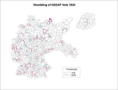
Figure 15: Significant Barriers in the NSDAP Voting Surface, 1930
The barrier map of the EzI estimates for the Nazi voter turnout
(Figure 16) shows fewer extensive boundaries than the overall NSDAP
surface.� While not particularly
continuous across multiple Kreise, significant
barriers demarcate weak regional characteristics.� In north-central
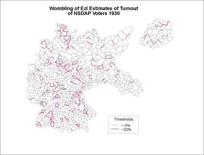
Figure
16: Significant Barriers in the Surface of EzI Estimates of NSDAP Voter Turnout
The final map (Figure 17) also displays barriers that divide
culturally distinctive regions, where support of Protestants for the NSDAP was
higher (or lower) than neighboring regions.�
This map is less �orderly� than the NSDAP EzI turnout map but certain
regions are again identifiable by scattered barriers.� High regions of Protestant support for the NSDAP
in
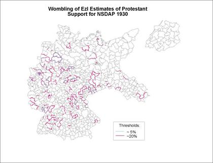
Figure 17:� Significant Barriers in the Surface for EzI
Estimates of Protestant NSDAP Support
The wombling analysis confirms previous exploratory spatial data
analysis conclusions about the lack of geographic pattern in the Weimar Germany
voting surfaces.� Numerous islands that
are distinctive from surrounding regions, urban-rural differences, weak
relationships between voting and socio-demographic characteristics, and lack of
countrywide trends are consistent across the maps of this paper.� While most analysts use multiple measures to
define barriers, I opted for the univariate modeling
since the multivariate barriers are often hard to explain and correlate with
other map features.� Wombling offers much
more potential use than has been the case in social science, perhaps hampered
by the lack of accessible software.� With
the growing use of exploratory spatial data methods that include recognition of
clusters (�hotspots�) and barriers, especially in epidemiological study (Bailey
and Gatrell, 1995; Griffith et al, 1998),
diffusion of these methodologies into the rest of human geography is expected.
10 Conclusion
In this paper, I have stressed the
benefits of exploratory spatial data analysis (ESDA) methods for examining a
puzzle of long standing in the social sciences: Who voted for the Nazi party in
Traditionally, the geographic factor (spatial autocorrelation) is modeled
out of the regression equations, though geographers have been arguing for over
30 years that these practices -�a throwing out of the baby and keeping the
bath-water� � Gould, (1970, 444) - miss the point that human societies are not
arranged in a statistically independent manner.�
Indeed, contra King (1996), geographers argue that the dynamics of human
interaction in communities of kindred individuals, driven by needs of security
and familiarity and/or by fears of the dissimilar, give rise to a �contextual�
element that is more than simply the sum of the effects of the community
composition.� Examples of these
contextual effects abound and the recent application of multi-level modeling of
survey data of political attitudes has shown that typically 10-20% of the
variance in the responses is attributed to contextual effects (Jones and
Duncan, 1998; O�Loughlin, 2002).������
Typically, the first step in any
geographic analysis is mapping - using a variety of techniques to explore the
structure of the spatially distributed data.�
The methods used in this paper rank among the most common, though the
use of point-based (centroidal) data is still
relatively uncommon in human geography because most census data are collected
for polygons (spatial entities).� In the
past two decades or so, there has been a retreat in geographic analysis from
complex multivariate modeling (factor analysis and canonical correlation
enjoyed their heyday in the 1970s) to a more focused attempt to understand
basic distributive properties of the key variables (Fotheringham
et al., 2000).��� It seems fair to conclude, though, that the
trend has been to build models with more geographic terms and fewer
compositional (socio-demographic) ones, partly as a result of a recognition of collinearity and the emphasis on parsimony, but also
because the geographic models are complex and include multiple terms (see
Griffith et al., 1998 for an
example).
Over two decade ago, Jean Laponce (1980) pointed out that geography was a net
importer from political science (in turn, a net importer from economics).�� My guess is that this net flow is still the
same.� What has changed is the revolution
in geographic methodologies of aggregate data analysis -some
of which are used in this paper- the integration of statistical and GIS
methodologies, and the theoretical conceptualization of context.� Unfortunately, many political scientists
continue to adhere to an out-moded conceptualization
of space, place and region.� Over time, as political scientists have moved
more and more to survey-based data analysis, the
advantages of aggregate data in certain circumstances have not been
noticed.� Previous dismissal of these
data due to perceived problems of ecological fallacy, inadequate methods for
handling spatial autocorrelation, and insufficient experience in mapping
geographic data are increasingly unwarranted.�
Further rapprochement of geographers and political scientists in
tackling issues of mutual interest is to be welcomed.�
References
Agnew, J. A. 1987. Place and Politics: The
Geographical Mediation of State and Society.
Agnew, J.A. 1988.�'Better Thieves than Reds'?
The Nationalization Thesis and the Possibility of a Geography
of Italian Politics.� Political Geography Quarterly, 7: 307-21.�
Anselin, L. 1988. Spatial Econometrics:
Methods and Models.�
Anselin, L. 1995. �Local
Indicators of Spatial Association � LISA.� Geographical Analysis
27: 93-115.
Anselin, L. 1998. Spacestat
Tutorial: A Workbook for Using Spacestat in the
Analysis of Spatial Data.
Anselin, L. 2000. �The
Alchemy of Statistics, or Creating Data Where No Data Exist.� Annals,
Association of American Geographers 90: 586-92.
Anselin, L. and S. Bao.
1997. �Exploratory
Spatial Data Analysis Linking SpaceStat and ArcView.� In Recent Developments in Spatial Analysis,
eds. M. Fischer and A. Getis.
Anselin, L. and A. Getis. 1992. �Spatial Statistical Analysis and
Geographic Information Systems.� Annals
of Regional Science 26: 19-33.
Ault, B. and W. Brustein. 1998. �Joining the Nazi Party.� American Behavioral Scientist 41:
1304-1323.
Bailey, T. and A. Gatrell.
1995. Interactive Spatial Data Analysis.
Harlow, Essex: Longman.
Barbujani, G. and R.R. Sokal. 1990. �Zones of Sharp Genetic Change in
Barbujani, G. and R.R. Sokal. 1991. �Geographic Population Structure of
Bocquet-Appel, J. P. and Bacro, J. N. 1994. �Generalized Wombling.� Systematic Zoology
43: 442-448.
Brunsdon, C., A. S. Fotheringham, and M. E. Charlton. 1998. �Geographically Weighted Regression - Modelling Spatial Nonstationarity.�
The
Statistician, 47, Part 3: 431-443.
Brustein, W. 1990. �The Political Geography of Fascist Party
Membership in
Brustein, W. 1996. The Logic of Evil: The Social Origins of
the Nazi Party, 1925-1933.�
Brustein, W. and J. Falter. 1995 �Who Joined the Nazi Party?: Assessing Theories of the Social Origins of Nazism.� Zeitgeschichte
22: 83-108
Childers, T. 1983. The Nazi Voter: The Social Foundations of
Fascism in
Cho, W. Tam and Anselin, L.
2000. �Spatial
Autocorrelation and EI: Some Further Results.� Paper presented at the
conference on �New Methodologies for the Social Sciences: The Development and
Application of Spatial Analysis for Political Methodology�,
Cliff, A.D. and J. K. Ord.� 1981.� Spatial
Processes: Models and Applications.�
Cressie, N. 1991. Statistics for Spatial
Data.
Davies-Withers, S. 2001. �Quantitative
Methods: Advancement in Ecological Inference.� Progress in Human Geography 25:
87-96.
Diggle, P. 2002. Statistical Analysis of Spatial Point
Patterns.�
Dutilleul, P., J.D. Stockwell, D. Frigon and P. Legendre.� 2000. �The Mantel Test versus
Pearson�s Correlation Analysis: Assessment of the Differences for Biological
and Environmental Studies.� Journal of
Agricultural, Biological and Environmental Statistics 5: 131-150.
Falsetti, A.B. and R.R. Sokal. 1993. �Genetic Structure of Human
Populations in the
Falter, J. 1986. Wahlen und Abstimmungen in der Weimarer
Republik.
Falter, J.� 1991.
Hitlers W�hler.�
Falter, J. and W. Gruner.
1981. Minor and Major Flaws of a Widely-Used Data Set; The
ICPSR �
Fotheringham, A. S. 1997 �Trends in Quantitative Methods,
I: Stressing the Local.� Progress in Human Geography 21: 88-96.�
Fotheringham, A. S. 2000. �A Bluffer�s
Guide to �A Solution to the Ecological Inference Problem�.� Annals,
Association of the Association of American Geographers 90, 582-86.
Fotheringham, A.S. and C. Brunsdon. 1999 �Local Forms of Spatial Analysis.� Geographical
Analysis 31: 340-358.
Fotheringham, A.S., C. Brunsdon and M. Charlton. 2000. Quantitative
Geography: Perspectives on Spatial Analysis.
Freeman, M. 1995.� Atlas of Nazi
Golden Software. 1999. Surfer
7.0 Users Guide: Contouring and 3-D � Surface Mapping for Scientists and
Engineers. Golden, CO: Golden Software.
Gould, P. 1970. �Is statistix inferens the Geographical Name for a
Wild Goose.� Economic
Geography 46, no. 2 (Supplement), 439-448.
Griffith, D.A., P.G.
Griffith, D.A. and LJ. Layne. 1999. A
Casebook for Spatial Statistical Data Analysis: A Compilation of Analyses of
Different Thematic Data Sets.
Grill, J.P. 1983.� The
Nazi Movement in
Grill, J.P. 1986. �Local and Regional Studies
on National Socialism.� Journal of
Contemporary History 21: 253-294.
Hamilton, R. 1982. Who Voted for Hitler?�
H�nisch, D. 1989. �Inhalt und Struktur der Datenbank �Wahl- und Sozialdaten
der Kreise und Gemeinden
des Deutschen Reiches von
1920 bis 1933�.� Historical Social Research
14: 39-67.
Heilbronner, O. 1998.� Catholicism, Political Culture, and the
Countryside: A Social History of the Nazi Party in
Johnston, K., J.M. ver Hoef, K. Krivoruchko
and N. Lucas. 2001. Using ArcGis�
Geostatistical Analyst.�
Johnston, R. and C. Pattie. 2000. �Ecological Inference and
Entropy-Maximizing: An Alternative Estimation Procedure for Split-Ticket
Voting.� Political Analysis 8: 333-345.
Jones, J.P. and
Jones, K. and C. Duncan. 1998. �Modelling
Context and Heterogeneity: Applying Multilevel Models.� In Research
Strategies in the Social Sciences. ed. E. Scarbrough and E. Tanenbaum.
Kaluzny, S.P., S.C. Vega, T.P. Cardoso and A.A. Shelly. 1998. S+ Spatial Stats: User�s Manual for
Windows� and Unix�.
Kater, M.H.�
(1983) The Nazi Party: A Social
Profile of Members and Leaders, 1919-1945.
Key, V.O. 1949. Southern
Politics in State and Nation.
King, G. 1996. �Why Context Should Not
Count.� Political Geography 15: 159-164.
King, G. 1997.� A Solution to the Ecological Inference
Problem: Reconstructing Individual Behavior from Aggregate Data.�
K�chler, M. 1992. �The NSDAP Vote in the
Laponce, J. A. 1980.�
�Political Science: An Import-Export Analysis of Journals and
Footnotes.� Political Studies 28: 410-19.
Mantel, N. 1967. �The Detection of Disease Clustering and
a Generalized Regression Approach.� Cancer
Research 27: 209-220.�
Oden, N..L and R.R. Sokal.
1986.�Directional Autocorrelation: An Extension of Spatial Correlograms in Two
Dimensions.� Systematic Zoology 35, 608-617.
O�Loughlin, J. 1986.� �Spatial Models of International Conflict:
Extending Theories of War Behavior.� Annals, Association of American
Geography 76, 63-80.
O�Loughlin, J. 2000a. �Can King�s Ecological
Inference Method Answer a Social Scientific Puzzle: Who Voted for the Nazi
Party in
O�Loughlin, J. 2002.� �Democratic Values, Trust, and Geographic
Context: A Multi-Level Analysis of the World Values Survey Data, 1990-97.� In Interrogating the
Globalization Project. ed. R. Honey.�
O�Loughlin, J. and L.
Anselin. 1991. �Bringing
Geography Back to the Study of International Relations: Spatial Dependence and
Regional Contexts in
O�Loughlin, J., C. Flint
and L. Anselin. 1994.
�The Geography of the Nazi Vote:�
Context, Confession and Class in the Reichstag Election of 1930.� Annals,
Association of American Geographers 84: 351-380.
O�Loughlin, J., C. Flint
and M. Shin. 1995.
�Regions and Milieux in
O�Loughlin, J., V. Kolossov
and O. Vendina.
1997.� �The Electoral Geographies of a
Polarizing City:
Ord, J.K and A. Getis. 1995. �Local Spatial Autocorrelation
Statistics: Distributional Issues and an Application.� Geographical Analysis
27: 286-296.
Passchier, N.
1980. �The Electoral Geography of the Nazi
Landslide.� In Who Were the
Fascists? , eds. S.U. Larsen, B. Hagtvet
and J.P. Myklebust.
Pollock, J. 1944. �An Areal Study of the German Electorate, 1930-1933.� American Political Science Review 38:
89-95.
Rogerson, P.A.
2000. Statistical
Methods for Geography.
Rohe, K. 1990. �German Elections and Party Systems in
Historical and Regional Perspective: An Introduction.� In Elections, Parties and Political Traditions: Social Foundations of
German Parties and Political Traditions, 1867-1987,� ed.
K. Rohe.�
Rosenberg, M.S. 2000 �The Bearing Correlogram: A New Method of Analyzing Directional Spatial
Autocorrelation.� Geographical Analysis 32, 267-278.
Rosenberg, M.S. 2002. PASSAGE: Pattern Analysis, Spatial
Statistics, and Geographic Exegesis. Version 1.0.
Rosenberg, M.S., R.R. Sokal,
N.L. Oden and D. DiGiovanni. 1999. �Spatial Autocorrelation of Cancer in
Siverson, R. M. and H. Starr. 1991. The Diffusion
of War: A Study of
Shin, M. 2001. �The Politicization of Place in
Sokal, R.R. and B.A. Thompson. 1998. �Spatial Genetic Structure of Human
Populations in
Stachura, P.D.
1980. �The Political Strategy of the Nazi Party, 1919-1933.� German Studies Review 3: 261-288.
Starr, H. 2002. �
St�gbauer, C.
2001.� W�hlerverhalten
und nationalsozialistische Machtergreifung:
�konomische, soziostrukturelle,
r�umliche Determinanten sowie kontrafaktische Politiksimulation.�
St. Katherinen: Scripta
Mercaturae Verlag.
Stone,
N. 1982. �Pillars of the Third Reich.�
Tobler, W. 1970. �A Computer Movie
Simulating Urban Growth in the
Tobler, W. 1976.� �Spatial Interaction Patterns.� Journal of Environmental Systems VI:
271-301.
Ward, M. D., ed. 1992.� The New Geopolitics.
Womble, W.H.� 1951. �Differential Systematics.�
Science 114: 315-322.
1 The original data used in this paper are available
from the Zentralarchiv f�r empirische Forschung of the Universit�t K�ln.� The
specific variables and the GIS (Geographic Information System) data in the form
of ArcView� 3.2 shapefiles and
associated data files are available from the Political Analysis website.���
[2]� �Some key exceptions have been special issues of Political Geography devoted to
contextual models of political behavior (Vol. 14, nos. 6/7, 1995) and to
controversies in political redistricting (Vol. 19, no. 2, 2000).� Both geographers and political scientists
contributed to the volume edited by Ward (1992) on The New Geopolitics.� Ongoing
sponsorship of workshops by the
[3]� The data were collated by Colin Flint for his (1995)
dissertation work that examined the diffusion of the NSDAP vote on a regional
basis from 1924 to 1933.� The number of
cases varies from election to election because of boundary changes and
aggregations.
[4] An alternative method of
inferring sub-unit values published in this journal from
[5] The number of Kreisunits varies from 883 to
940 in the
[6] See
Jones and Cassetti, 1991 for the spatial expansion
model;� Brunsdon et al., 1998; Fotheringham
and Brunsdon, 1997; and Fotheringham
et al , 2000 explain geographically-weighted regression.
[7]
Available from www.public.asu.edu/-mrosenb/Passage/
[8] Thanks are due to Ron
Johnston and Mike Ward for suggesting that the directional biases underlying
the bearing correlograms should be examined.
[9] An example is inter-censal elderly population flows in the
[10]� In landscape topographies, steep gradients
(indicated by closely-spaced contour lines) are the zones of greatest surface
changes.� In genetic study, such as those
of allele (a genetic marker) frequencies, barriers are important to identify
since they show the areas over which genetic flow (population movement) is
reduced or stopped (Sokal and Thompson, 1998).��
[11] Fuzzy boundaries are appropriate when only point data are available and inter-point boundary interpolation is used